NatureScore A nature score for every address in America.
The foundation NatureDose and NatureQuant's data tools were built on.
Overview
Every address in the US has a walkability score, an air quality index, a flood risk rating. But until NatureQuant, no one had built a reliable, data-driven measure of how much nature a location actually offers.
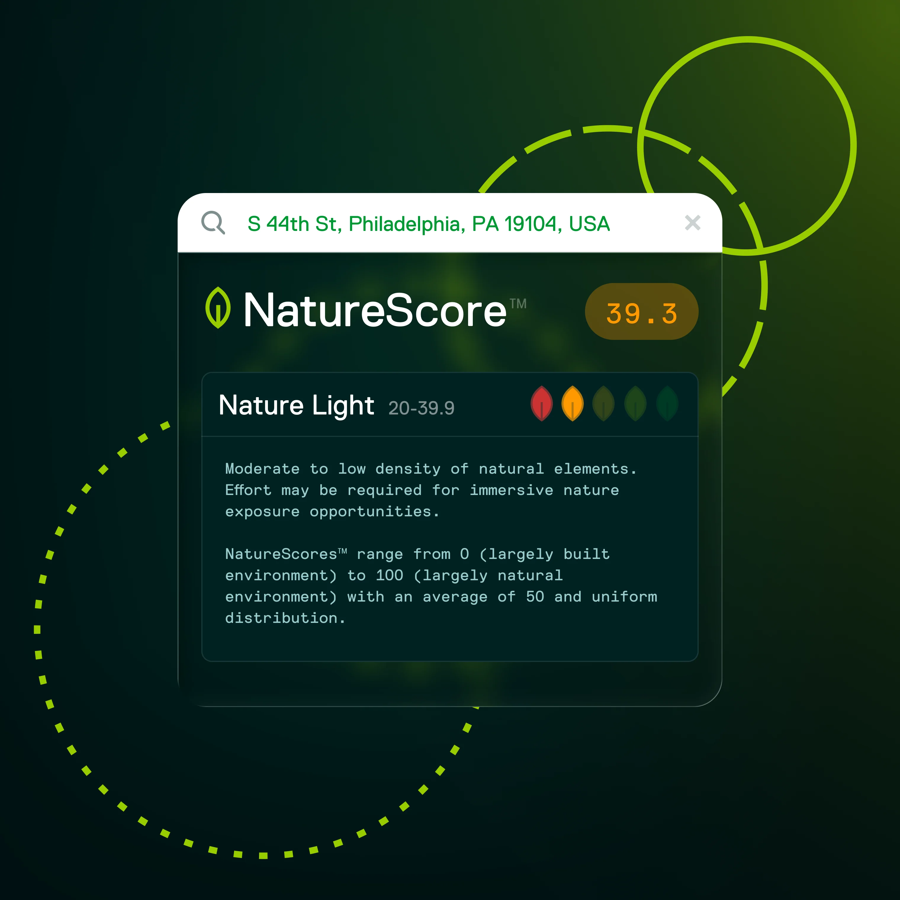
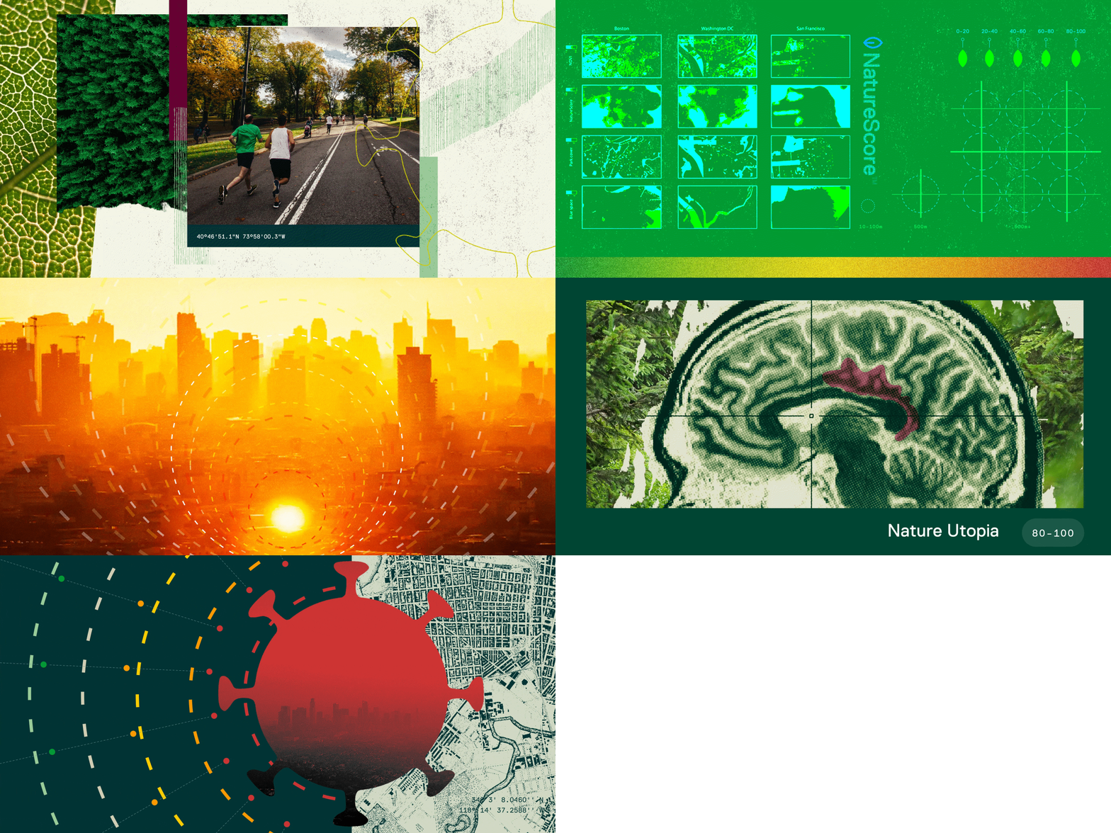
I led the UI and UX design for NatureScore®, NatureQuant's first product. The underlying score, built by NatureQuant's engineering team, combines satellite imagery, tree canopy metrics, air and noise pollution data, land classifications, and computer vision into a consistent 0 to 100 rating for any location. I shaped the brand, built the launch website, and worked closely with engineers to design the mapping and data visualization tools that made that score legible to planners, researchers, and individuals alike.
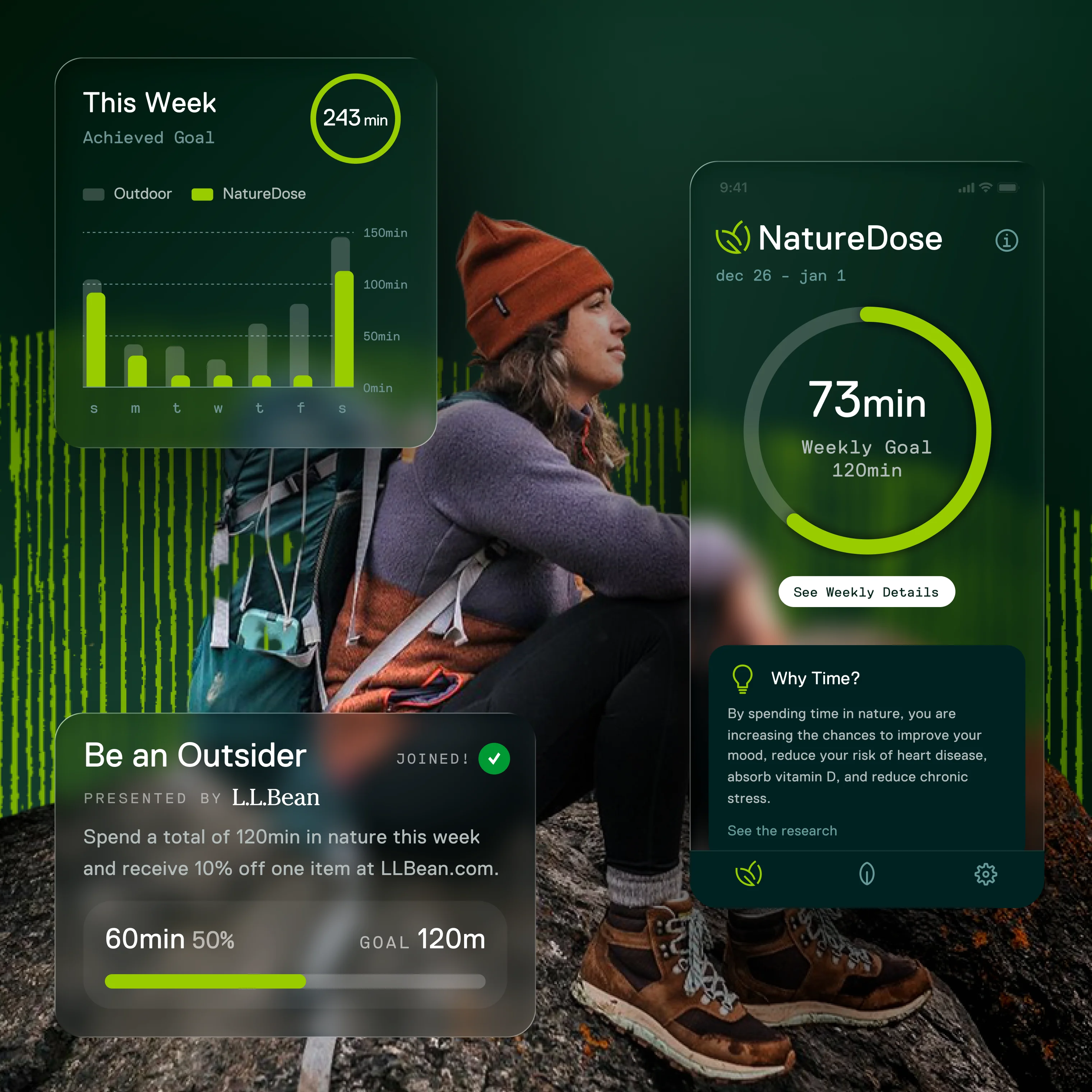
NatureScore became the foundation for everything that followed, setting the visual and product direction for NatureDose® and NatureQuant's open data tools.

Challenges
Translate complex GIS and environmental data into simple, human-readable insights.
Build a brand and design system that feels both scientific and accessible.
Design a scalable foundation for NatureQuant’s future data and consumer products.
Contributions
Brand & Identity
I designed the logo, visual system, and tone for NatureScore, creating an identity that felt scientific, accessible, and forward-looking.
Data Visualization & Mapping
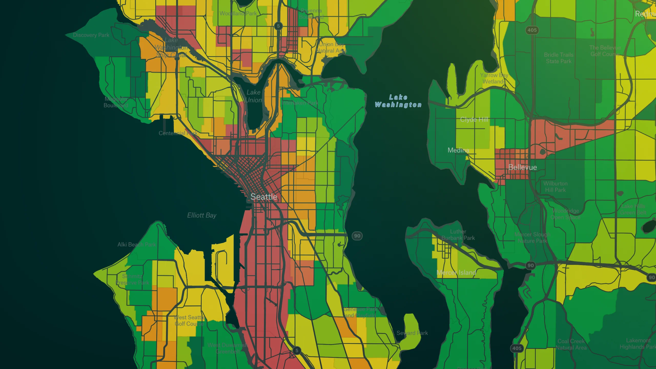
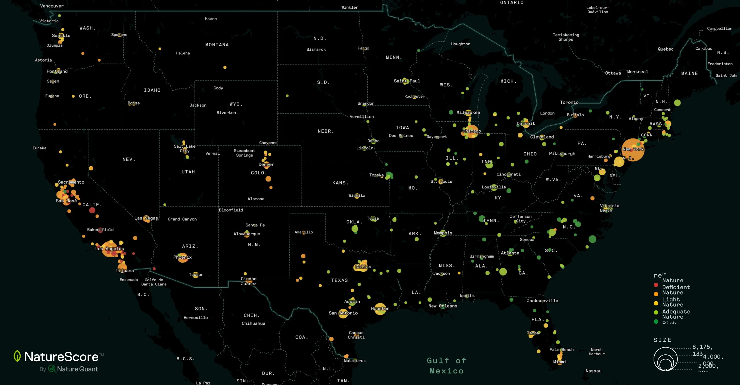
NatureQuant's engineering team built the underlying score, blending satellite infrared, tree canopy metrics, air/noise/light pollution, land classifications, and computer vision from aerial and street imagery. I designed the maps and visualizations that made that data legible, working closely with engineers from data structure through to the final interface.
Website & Launch Materials
I created the launch website, white papers, and pitch decks targeting both research and enterprise customers, ensuring clarity and credibility in communication.
Feature Ideation
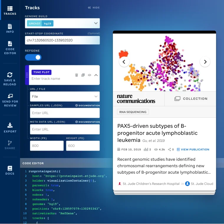
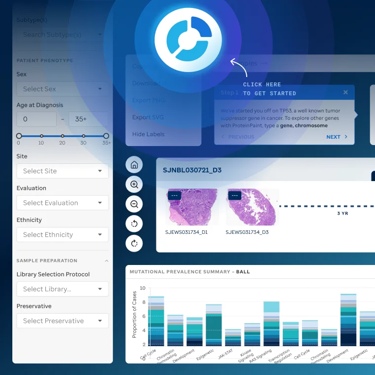
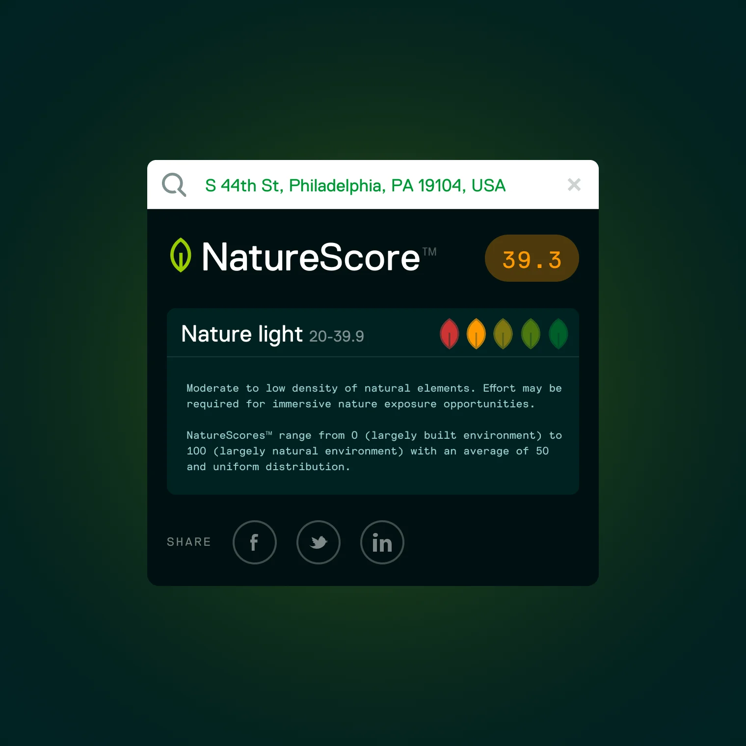
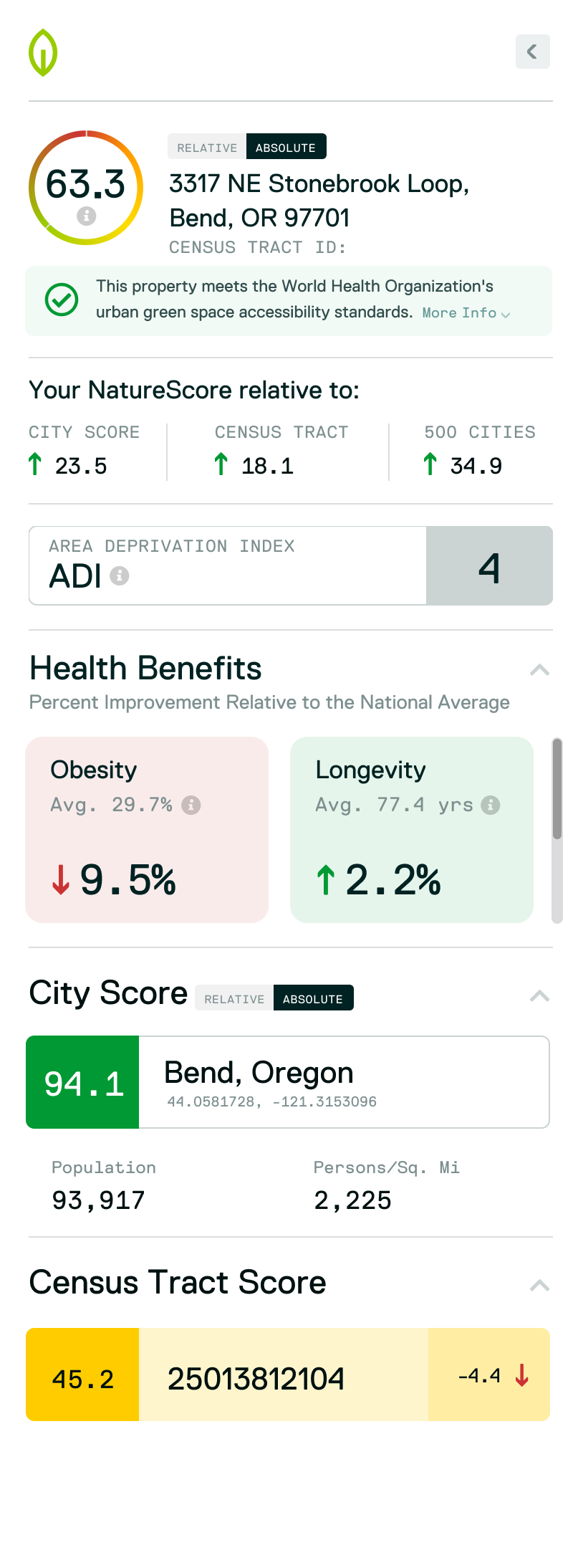
Collaborated with engineers on features such as address lookup, heat-map visualizations, real-time mapping layers, and printable reports for analysts and planners.
Design System Integration
Established a unified design language, spanning colors, icons, typography, and visuals, to align the web interface, mapping tools, and marketing materials.
Design
The design challenge was two-fold: make very technical data visually digestible, and build trust through clarity.
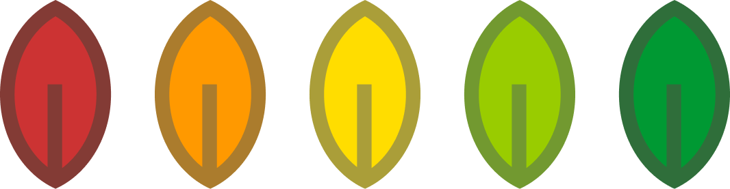
Maps show scores using a red-to-green leaf scale, clearly signaling how "nature-rich" each location is. Reports and visuals were designed for planners, researchers, city officials, and individuals alike, keeping the data front and center with a clean, grid-based layout and strong typography.

Impact
NatureScore became a foundational product for NatureQuant, enabling new conversations about nature, health, and equity.
It supports mapping tools down to 10-meter resolution, custom polygon data, and layered metrics for environmental justice applications. Nature planners use it to target tree-planting in underserved neighborhoods; real estate analysts use it to evaluate green-space value; and public health researchers use it to study nature exposure outcomes.
Reflection
The hardest design problem here was trust. A score of 72 is meaningless unless the person reading it believes the number. That meant making the inputs visible, showing what the score is made of, not just what it says, and designing a visual language that felt authoritative without being opaque.
It’s still one of the most technically dense things I’ve worked on. Getting it to feel simple took a lot of deliberate choices about what to show and what to leave out.