Visualization Community Genomic visualizations that outlive the journal figure.
80+ published visualizations. 68k views on the top community piece.
Overview
Genomic visualizations at St. Jude were stuck: locked on local machines or flattened into static journal figures that lost all their interactivity the moment they were published. Researchers who wanted to revisit or share them had to start from scratch.
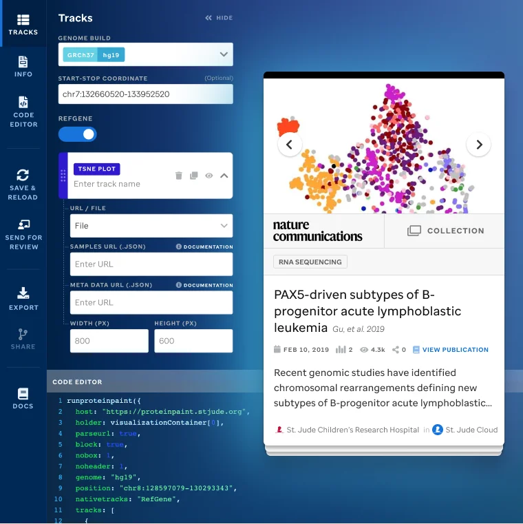
I led design for the Visualization Community, a platform on St. Jude Cloud that lets scientists publish, explore, and share living visualizations, without needing to learn how to write or run code specifically for ProteinPaint. What used to take weeks, now takes minutes. Just plug in your data's URL and visualize it with ProteinPaint.
I designed it alongside St. Jude's data scientists and engineers. The interface and identity were mine. The visualization types and the interactions came out of working sessions with the people who would use them.
Published visualizations produced across research projects
Visualizations featured in Nature, Cancer Discovery, and peer-reviewed journals
Research teams connected across institutions
Views for the leading publication visualization
Views for the AGI Community piece
Consecutive nominations for the Visualization is Beautiful Award
Challenges
Pediatric cancer research generates enormous datasets. The insights are in there. Getting them visible and shareable is a different problem.
Published visualizations went flat. Updating one meant asking an engineer. Sharing one meant starting over.
Contributions
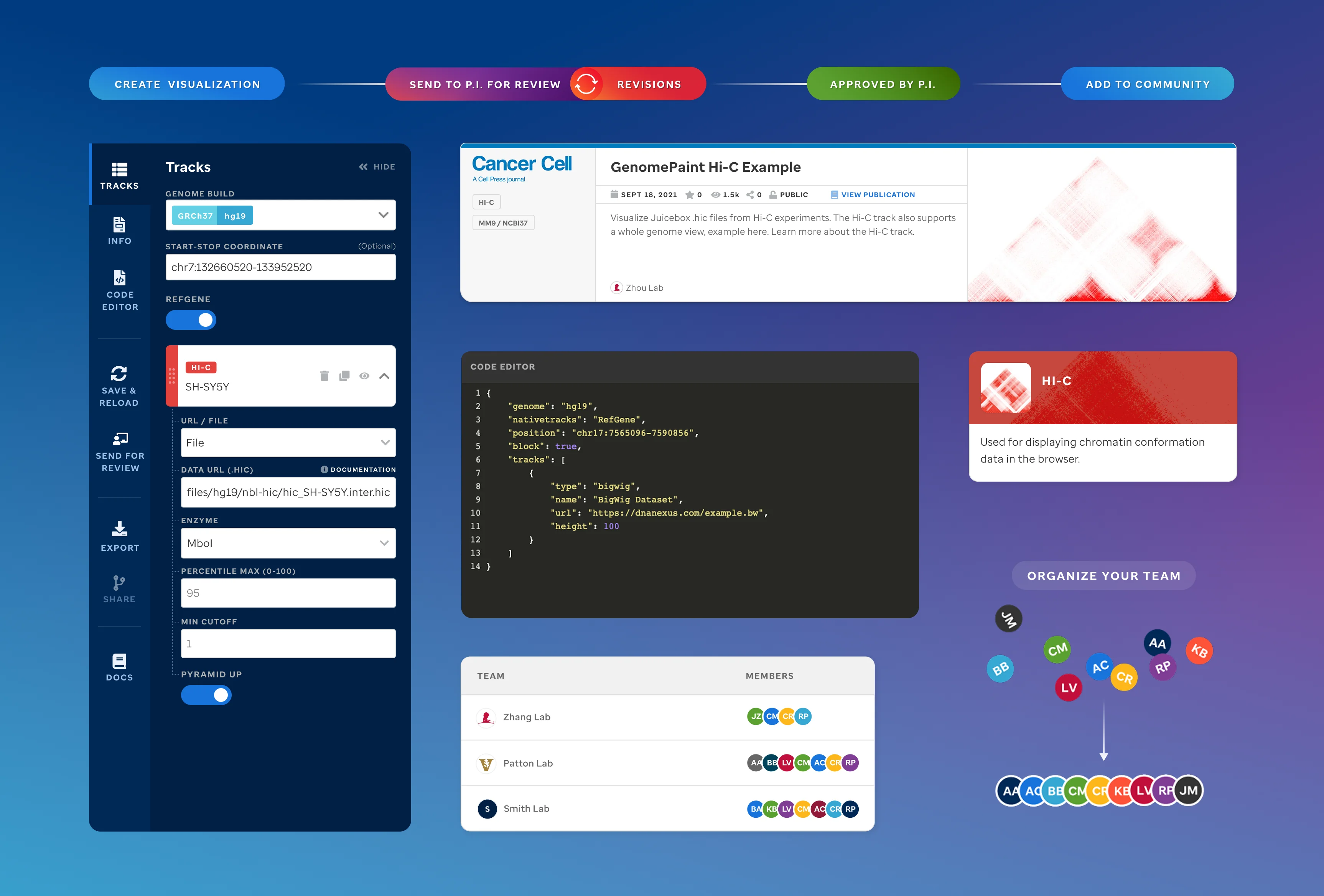
St. Jude Cloud was already committed to open data, so it was the right foundation. I designed the full product: identity, homepage, editor, track library, sample data views, and community pages. No technical setup required to publish.
Visual Identity
The logo and visual system that carries through the platform.
 Visualization Community logo
 3D Genome Consortium logo, a collaboration between St. Jude and The Broad Institute at MIT
Platform Design
Homepage, visualization explorer, editor, sample data views, community pages.
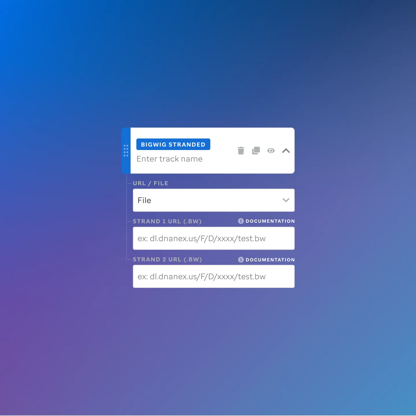
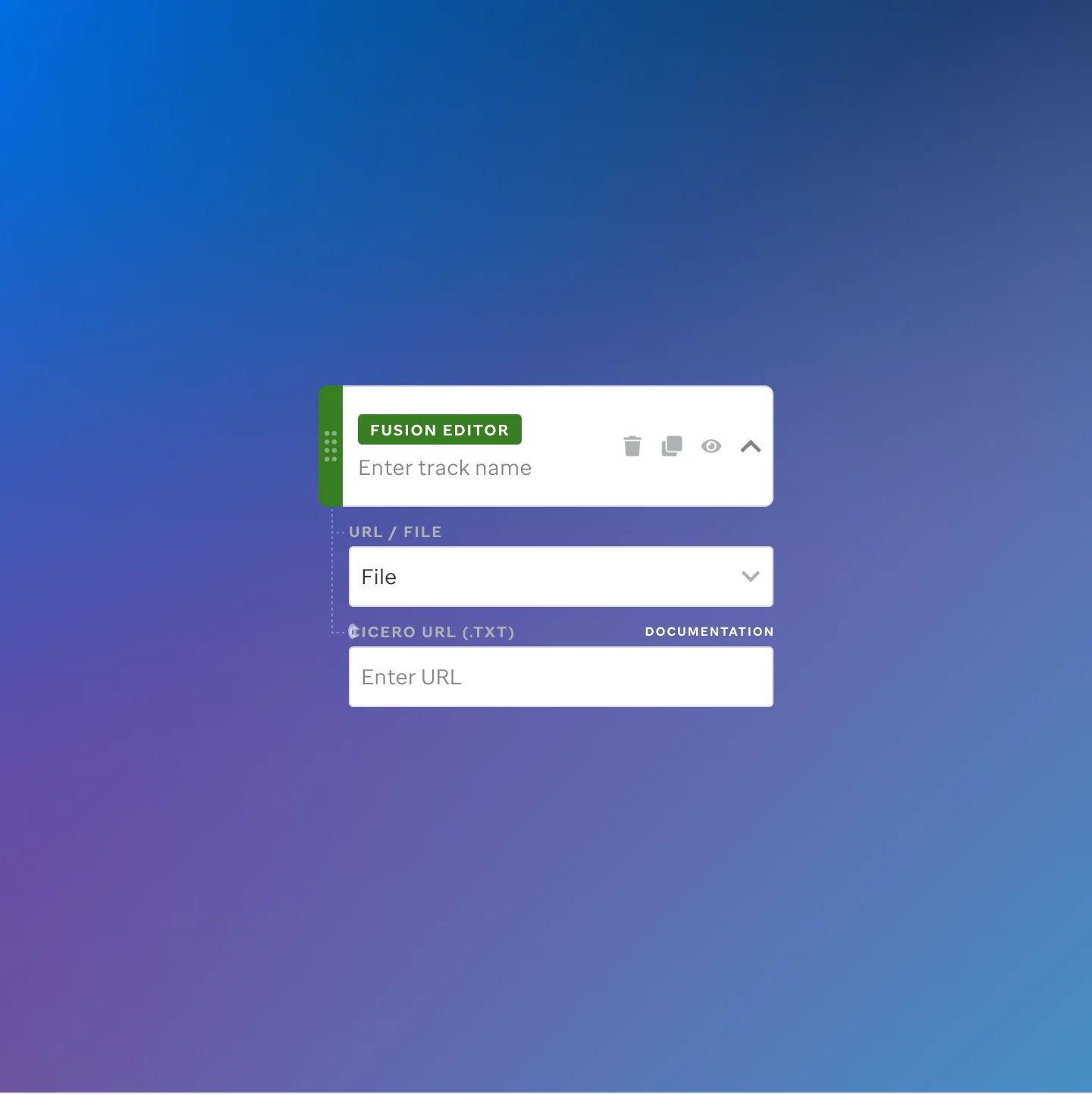
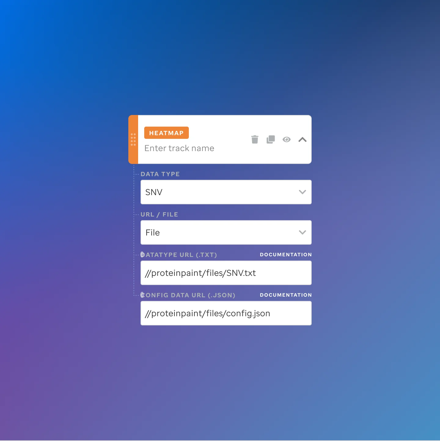
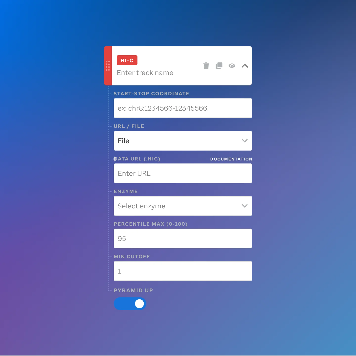
 Visualization editor: track configuration view
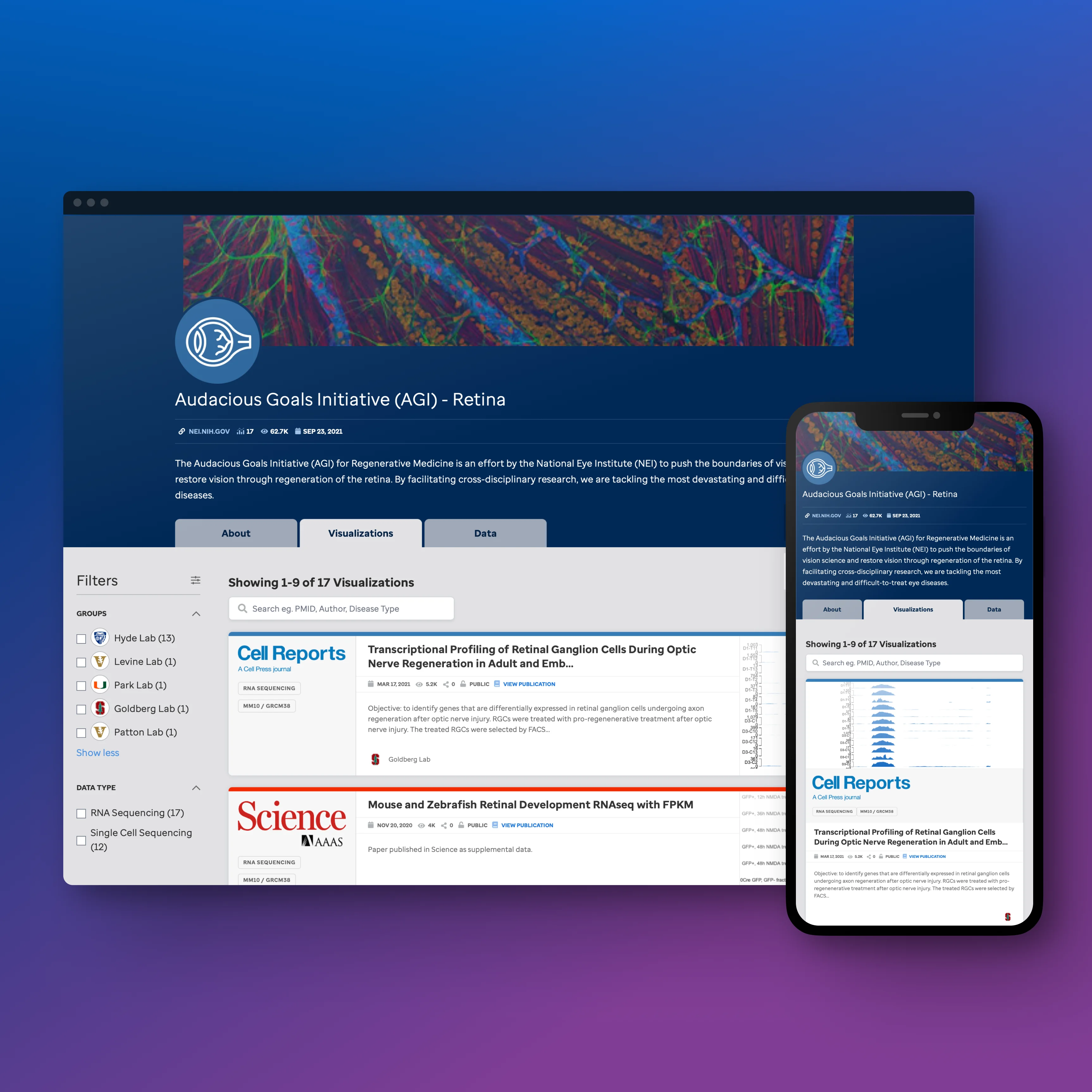 Communities view
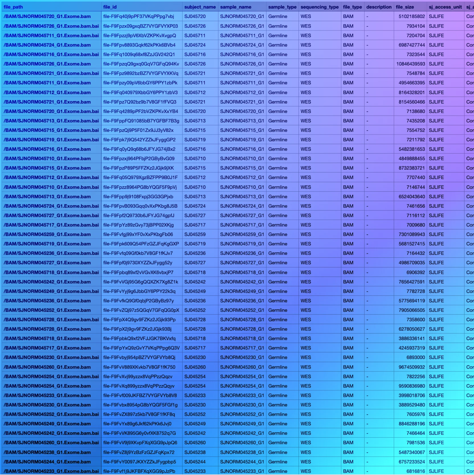 Sample data browser
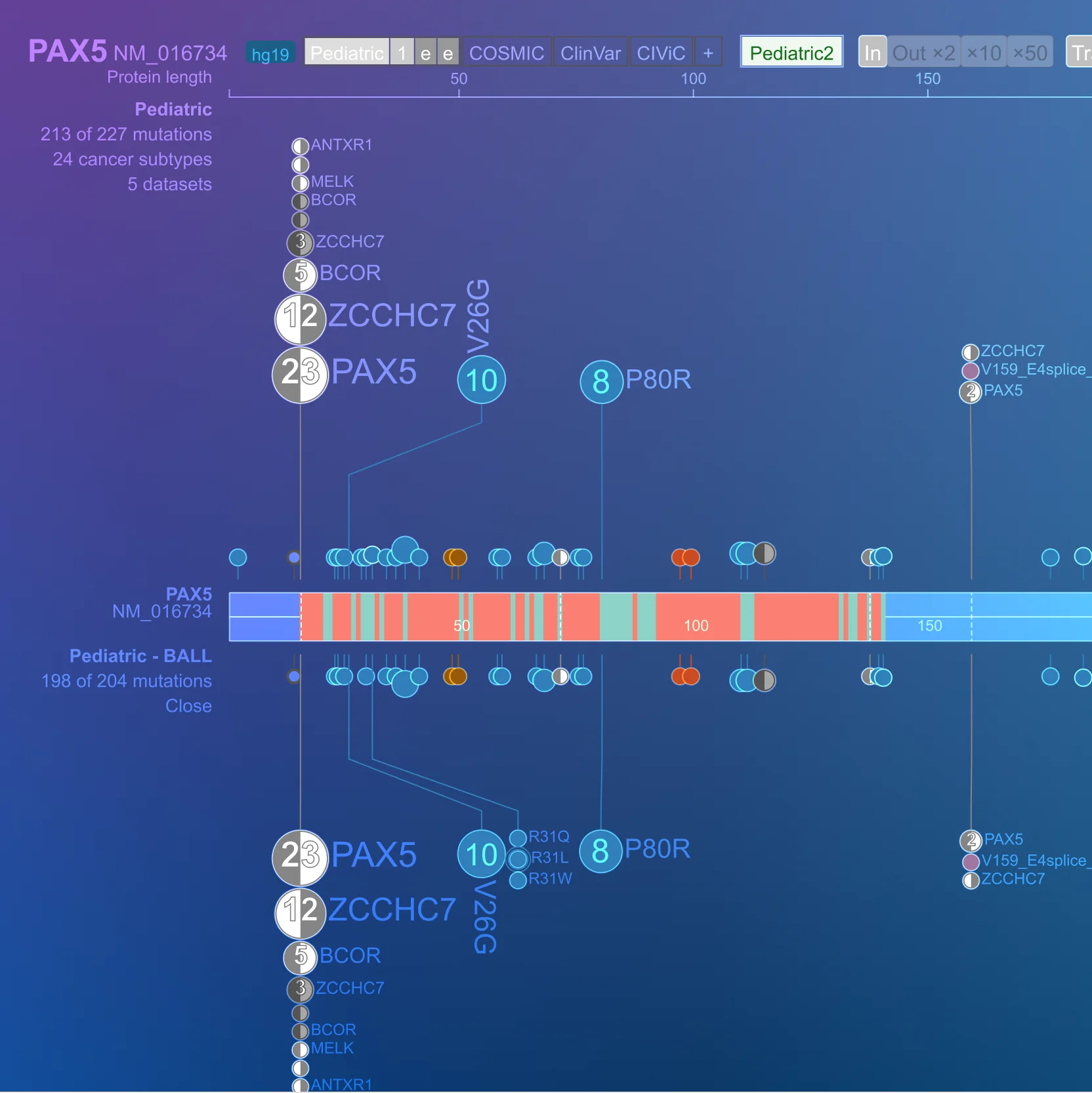 ProteinPaint visualization
"Anyone who goes into the visualization applications can look for the underlying data, analyze it, and publish using it if they find something novel. It's really a resource for the entire academic community."
Design
Gene expression, mutation plots, genome-wide tracks. Every type had to be findable and labeled the same way.
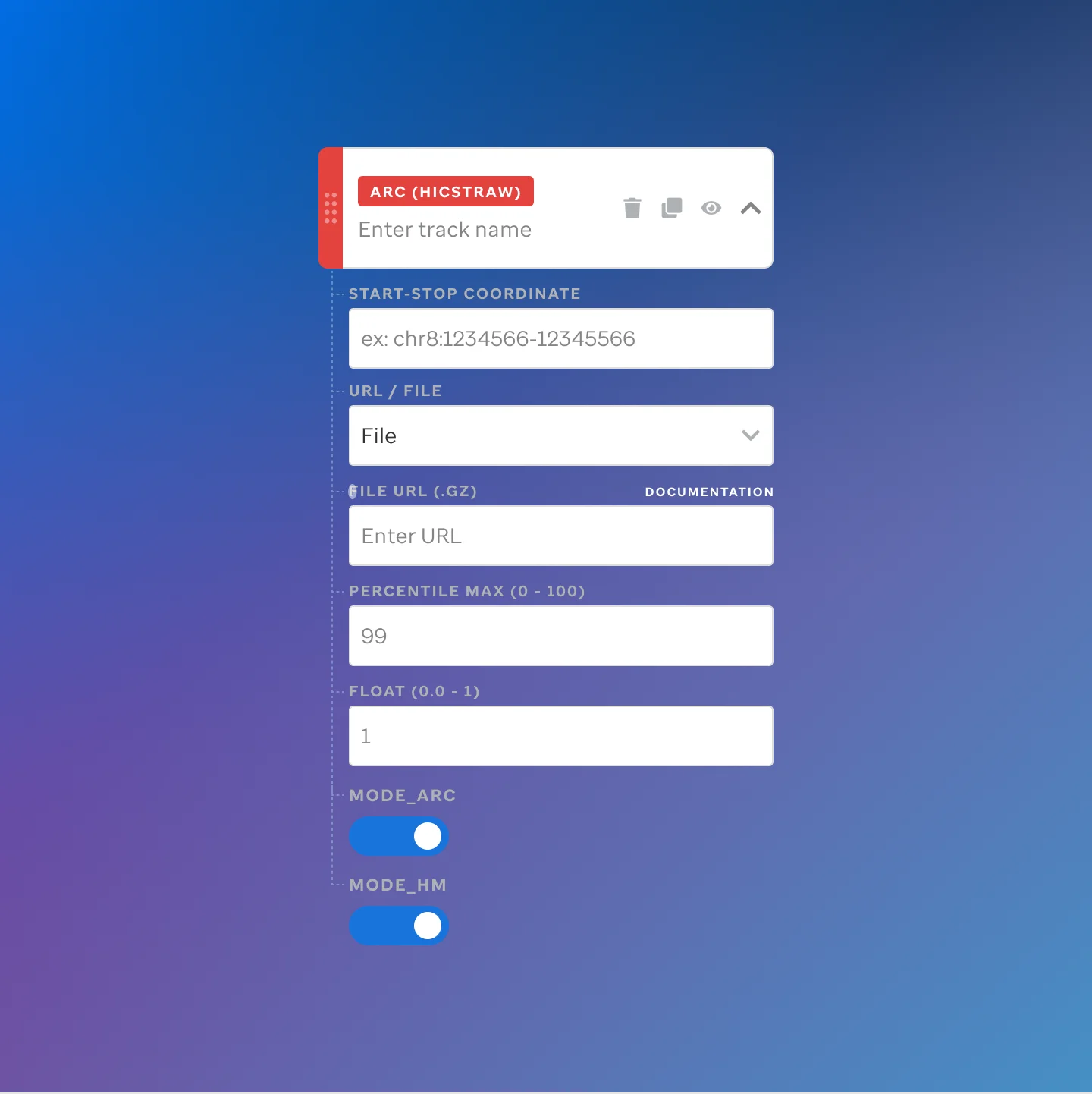
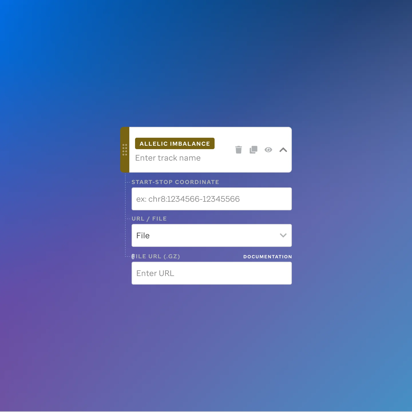
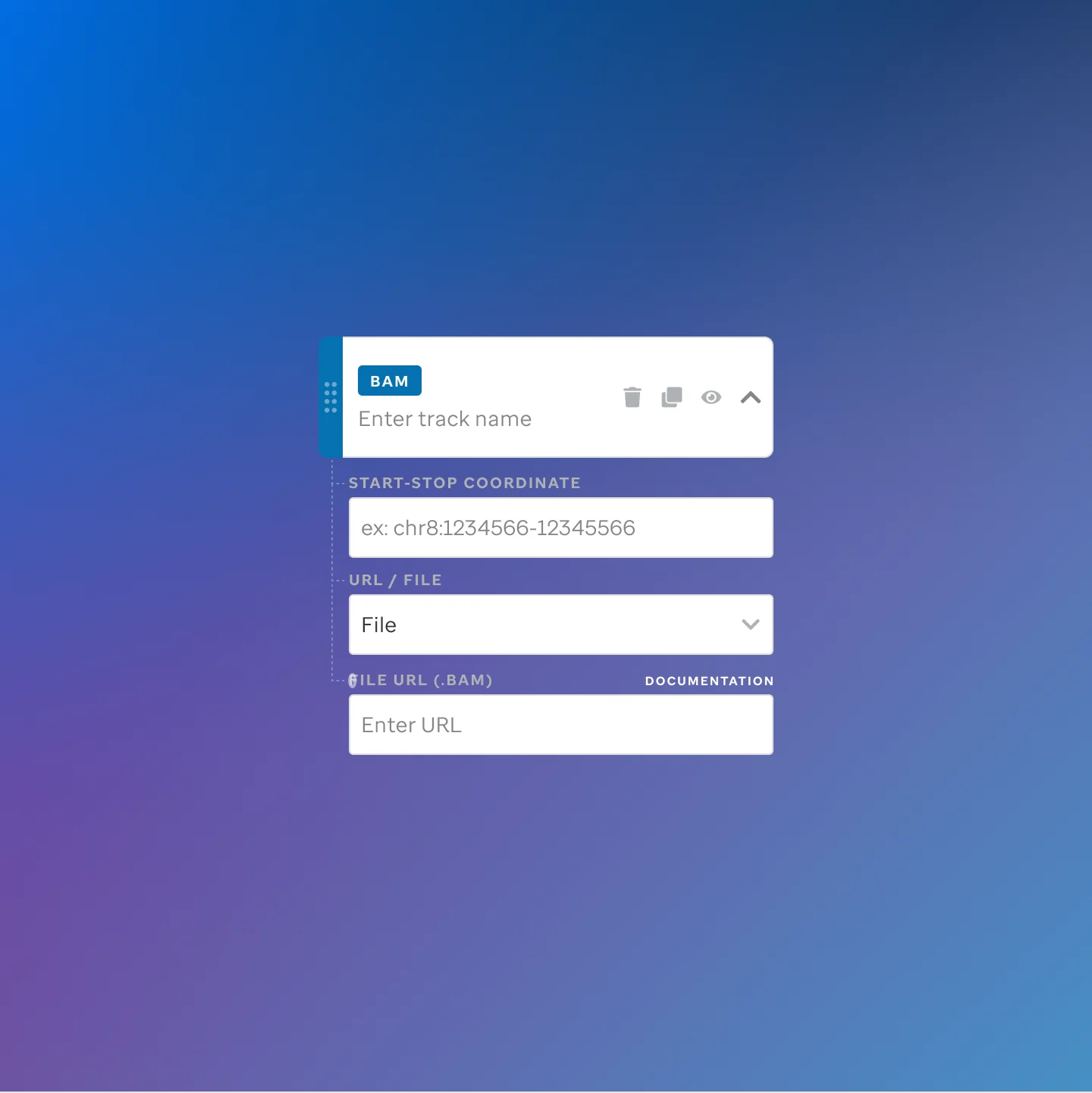
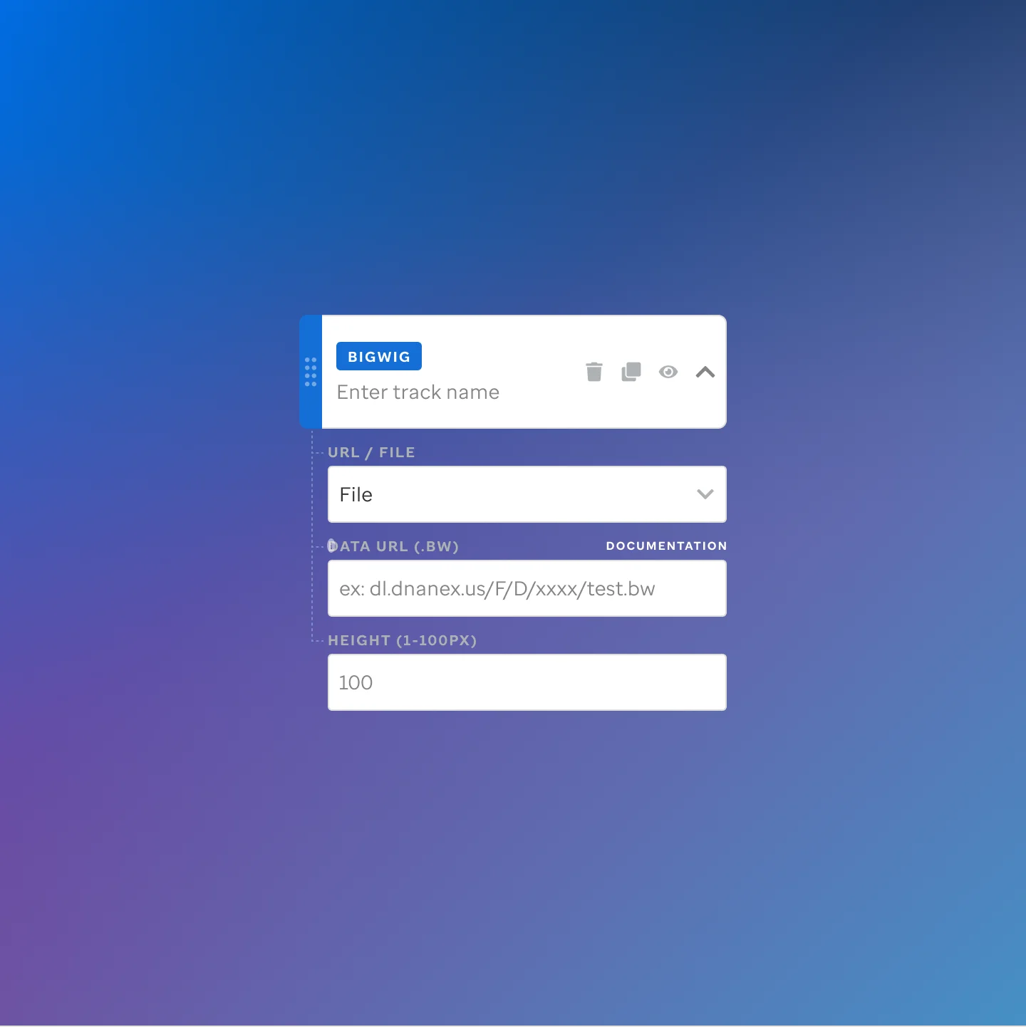
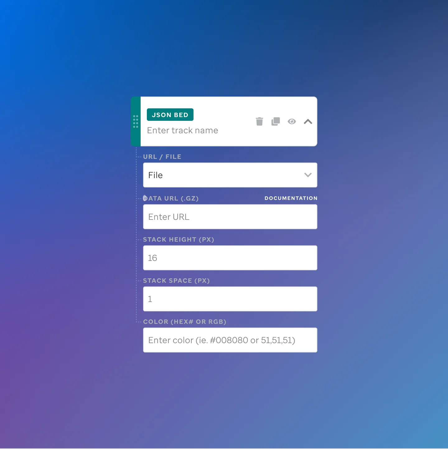
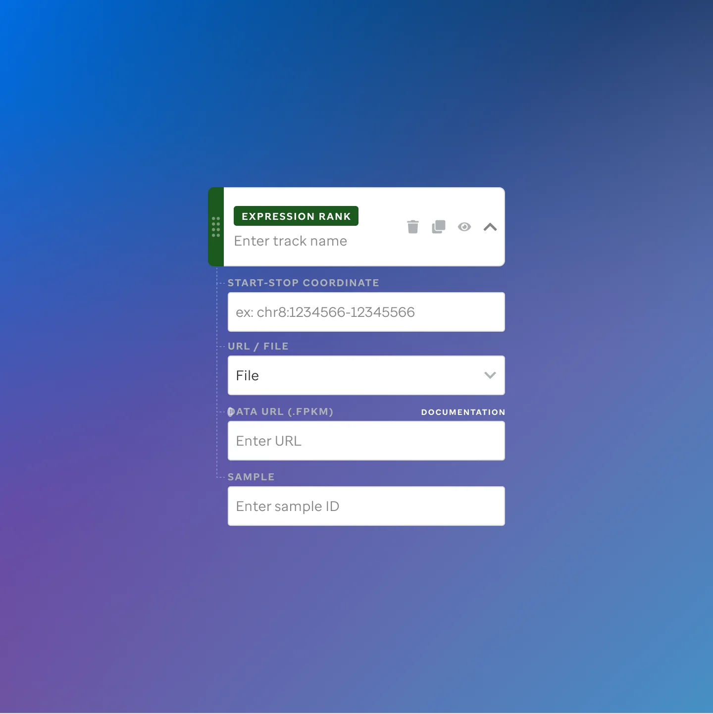
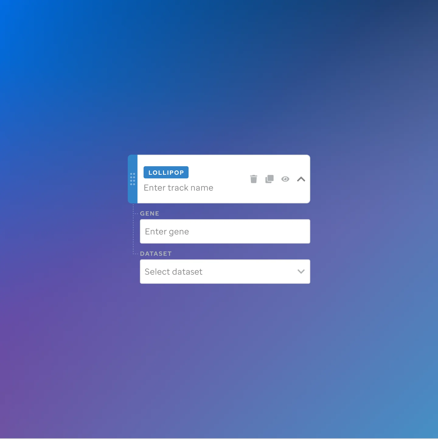
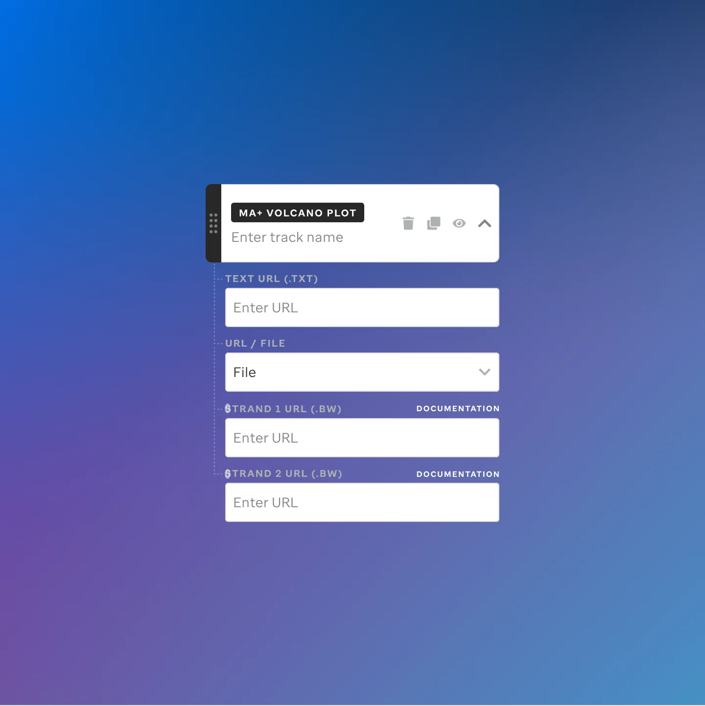
I designed the track library and the patterns for browsing, configuring, and publishing.
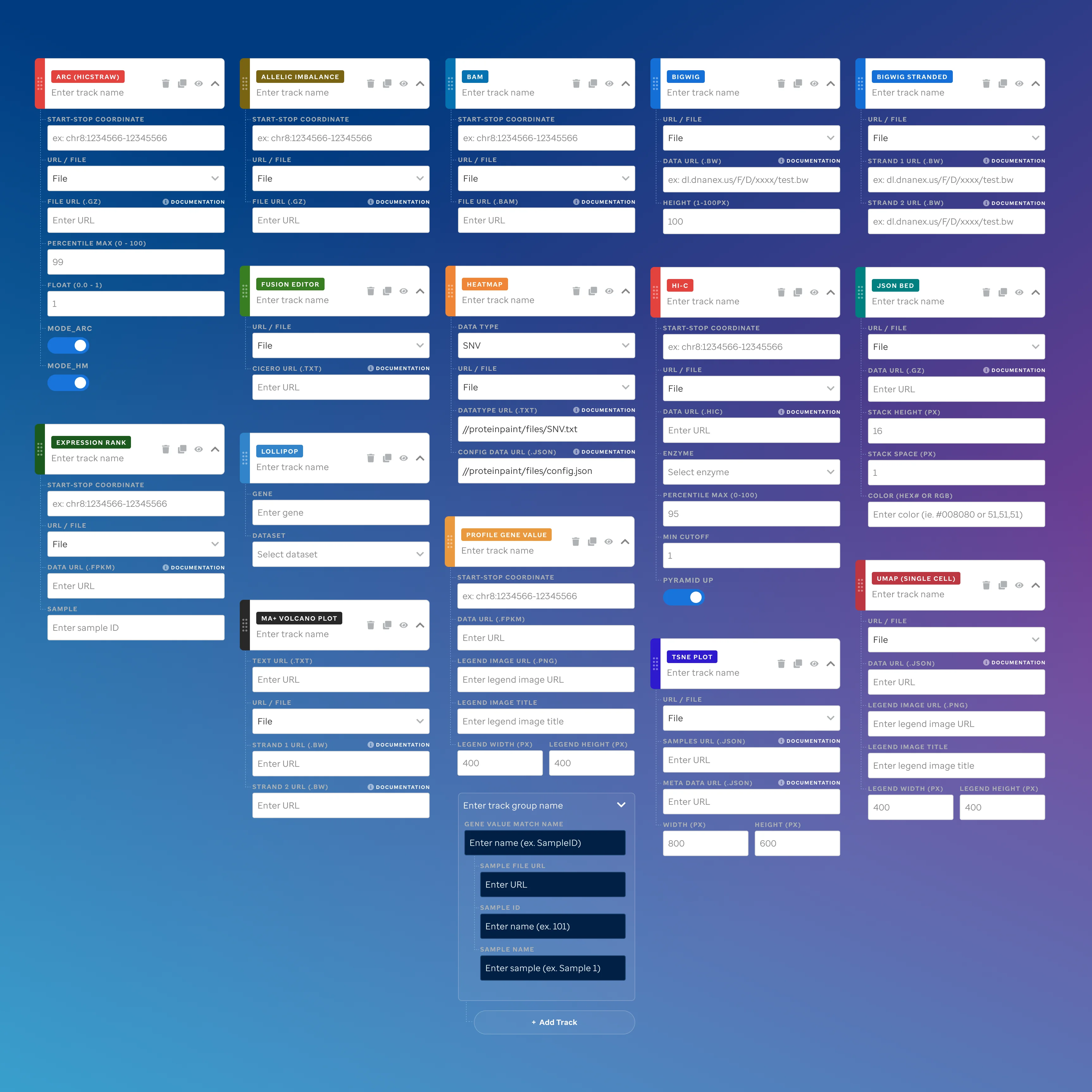
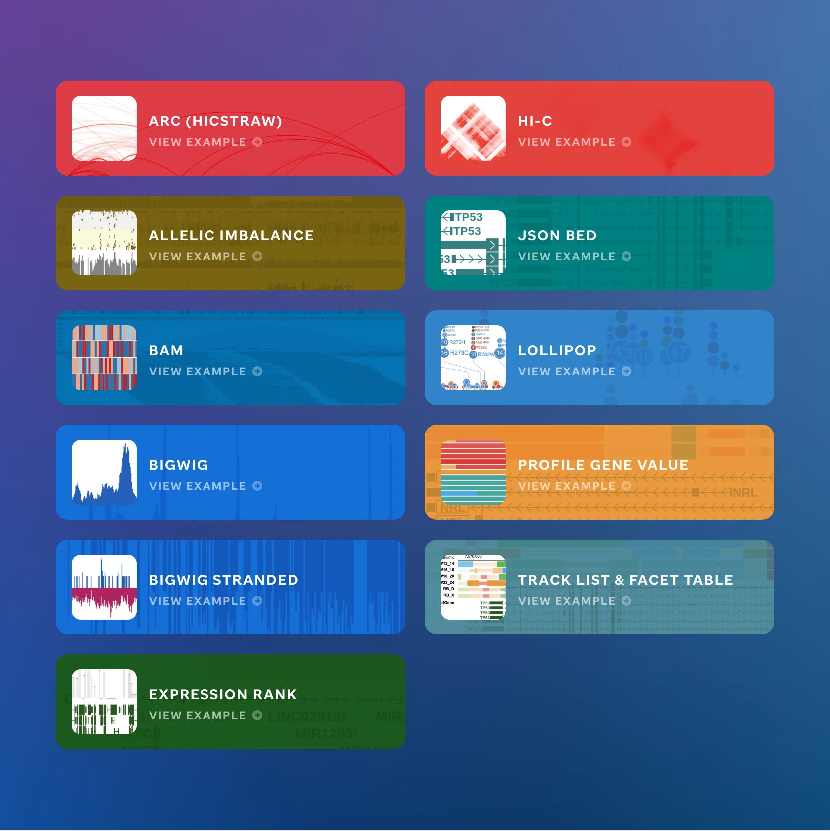 Visualization track type overview
Code Editor
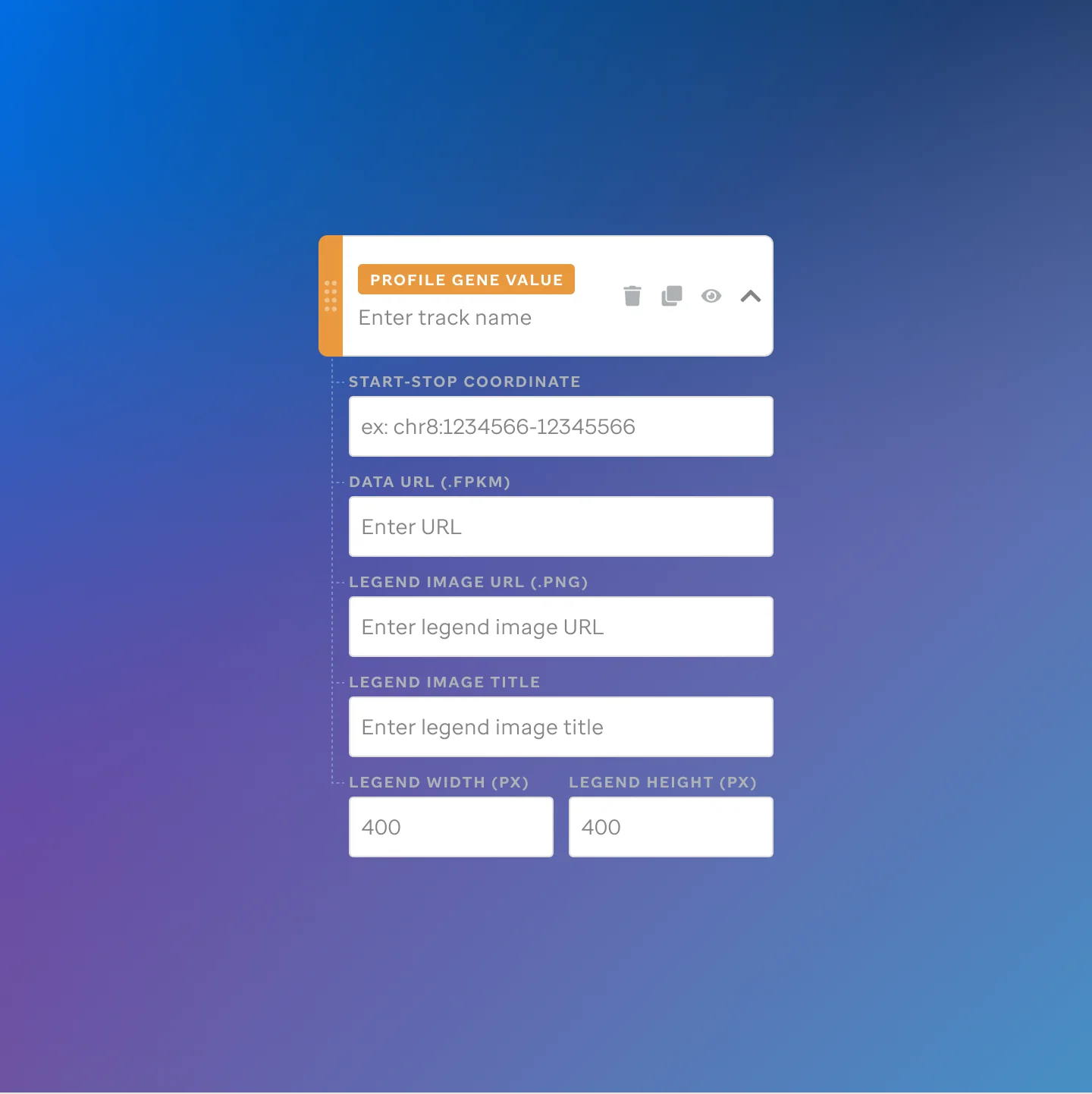
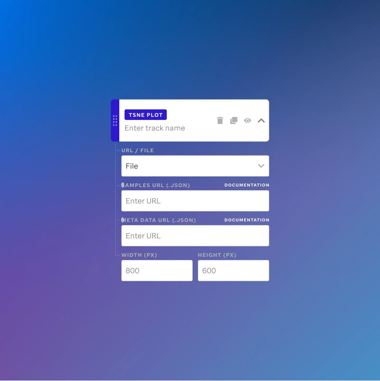
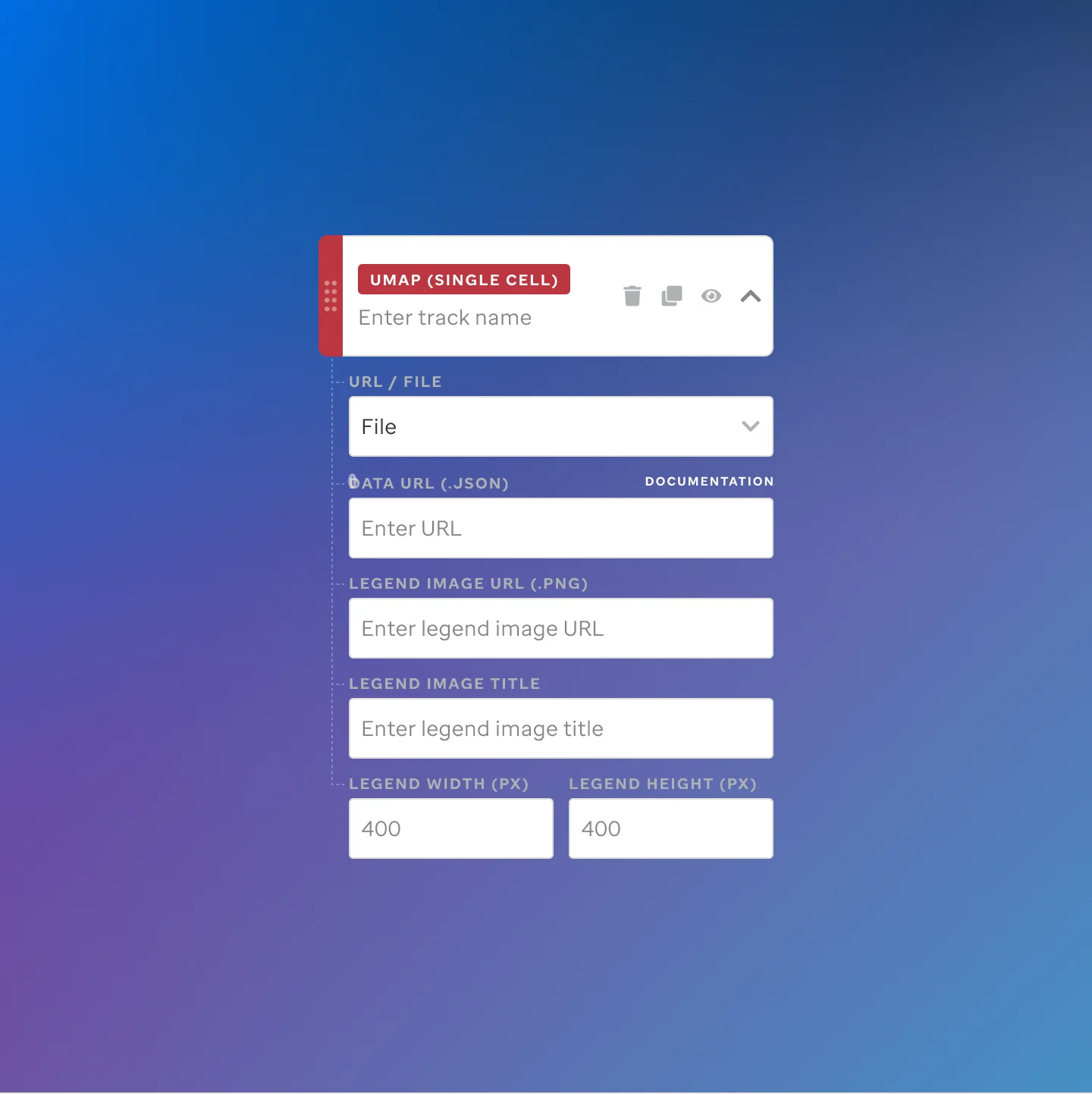
Each track type gets its own editor view: change a parameter, see the output.
 St. Jude Cloud: Visualization Community
Impact
Researchers move faster.
They can build and update visualizations without waiting for technical help.
Access is reliable.
Data and visualizations now live in one stable, public home.
Insights run deeper.
Scientists can explore datasets in real time instead of relying on static images.
Impact extends further.
Teams around the world can now build on each other’s work.
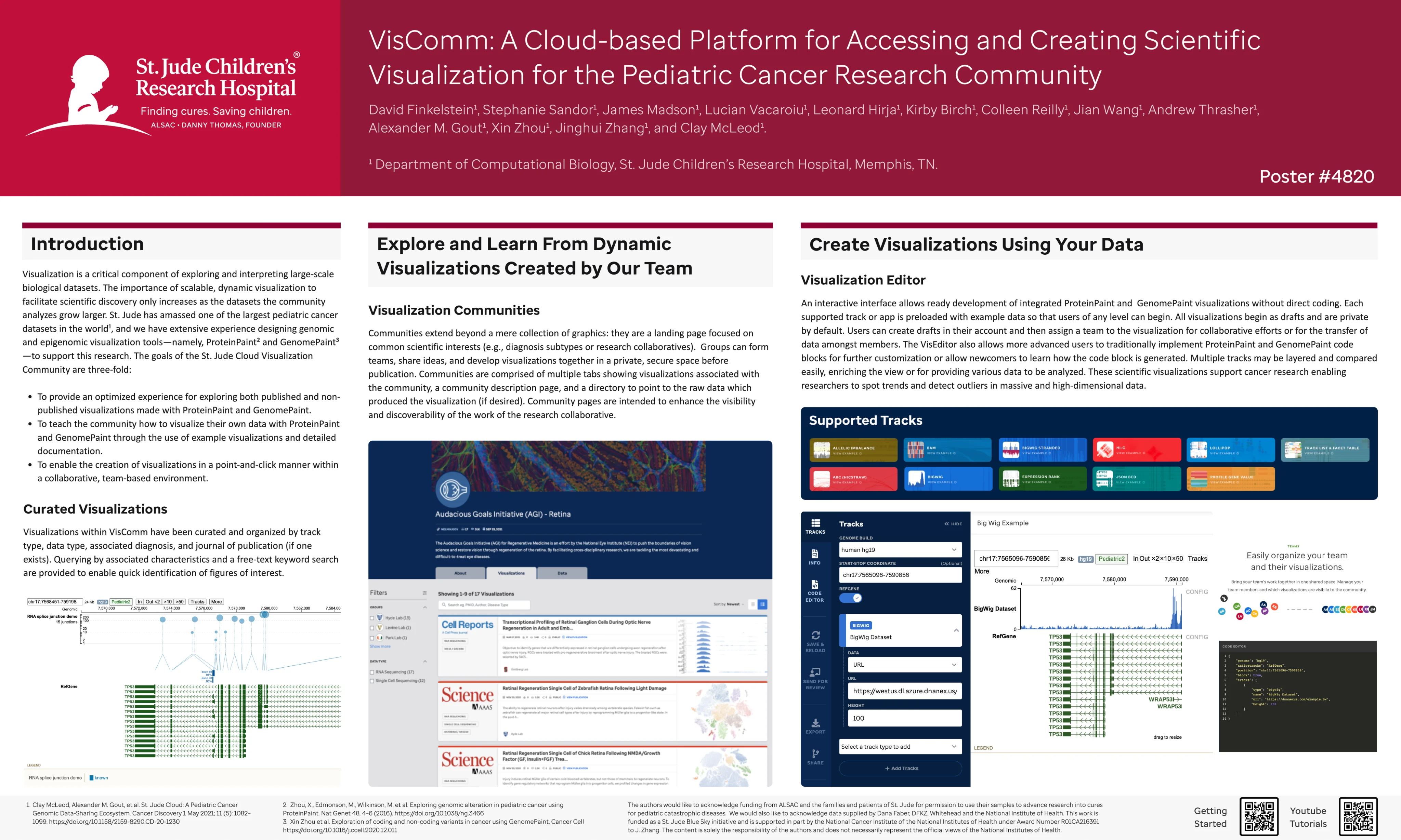 AACR conference poster presenting the Visualization Community platform
Reflection
Designing for researchers taught me that interface complexity has a real cost. When the tool is confusing, scientists ask for help instead of exploring. When it’s clear, they go further on their own.
The most meaningful moment on this project wasn’t a launch metric. It was watching a researcher configure and publish a visualization in a few minutes that would have taken a week before. That’s what the design was for.